matplotlib可视化数据
matplotlib对于数据可视化非常重要,它完全封装了MatLab的所有API,在python的环境下和Python的语法一起使用更是相得益彰。
库的安装和环境的配置
windows下:py -3 -m pip install matplotlib
linux下:python3 -m pip install matplotlib
建议配合Jupyter使用。在jupyter notebook中,使用%matplotlib inline,即可进入交互页面
设置中文环境
首先引入包:
1 | #-*- coding: utf-8 -*- |
一窥全貌
首先,我们画一张正弦和余弦图。
1 | plt.figure('sin/cos', dpi=70) |
- plt.figure(name,dpi):name是图片的名字,dpi是分辨率
- plt.plot(x,y,color,linewidth,linestyle,label):用来绘制点线图。color是线条颜色,linewidth是宽度,linestyle可以设置成’–’(两个短杠),就变成了虚线。label参数和图例有关
- plt.xlim(min,max)/plt.ylim(min,max):设置x/y轴的范围。
- plt.xtricks(列表)/plt.ytricks(列表):设置x轴/y轴的上显示的值。如果想要设置记号标签,可以传入两个对应的列表。
- plt.legend(loc=随机默认):添加图例,图例来自于plt.plot()参数里的label,如果想让label按照公式显示,需要在字符串前后加美元符号。
即:label=’$sin(x)$’。oc参数定义图标位置,可以是upper left/right类似的方向。 - plt.xlabel(labelname)/ylabel(labelname):添加x/y轴的名字并且显示出来。
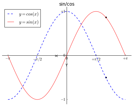
- plt.scatter(xlist,ylist):根据需要标注图中的特殊点。
- plt.title():给图一个名称。
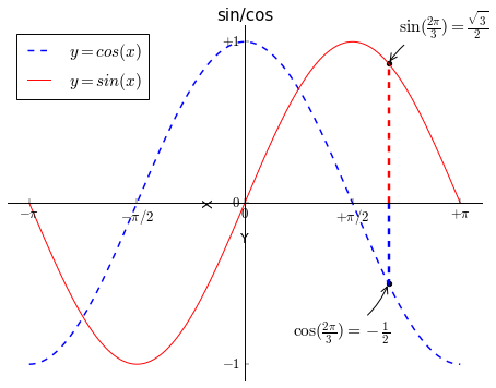
- 移动坐标轴:(之前的图片还是不好看)实际上每幅图有四条脊柱(上下左右),为了将脊柱放在图的中间,我们必须将其中的两条(上和右)设置为无色,然后调整剩下的两条到合适的位置——数据空间的 0 点。
ax = plt.gca()
ax.spines[‘right’].set_color(‘none’)
ax.spines[‘top’].set_color(‘red’)
ax.xaxis.set_ticks_position(‘bottom’)
ax.spines[‘bottom’].set_position((‘data’,0))
ax.yaxis.set_ticks_position(‘left’)
ax.spines[‘left’].set_position((‘data’,0))
改进后的代码如下:
1 | plt.figure(figsize=(8,6), dpi=70) |
精益求精
1 | plt.figure('sin/cos',figsize=(8,6), dpi=70) |
我们添加了标注点,并且向x轴做了垂线,使其更清晰。
图的存储
这么漂亮的图,还是通过plt.savefig(照片名字+后缀名)保存到本地吧。
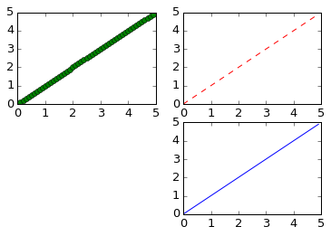
子图
plt.subplot(x,y,n):将图片分成x*y块,这个图是第n个。(看示例)
- 示例一:
1 | x = np.arange(0, 5, 0.1) |
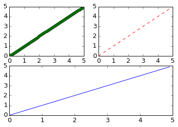
- 示例二:
1 | x = np.arange(0, 5, 0.1) |
感谢您的阅读,本文由 Gavinhome Blog 版权所有。如若转载,请注明出处:Gavinhome Blog(http://gavinhome.github.io/2019/01/25/matplotlib可视化数据/)